
How to Add a Mobile Information Bar to Your Squarespace Website
In the fast-paced world of mobile browsing, having quick access to essential information on your website can significantly enhance user experience. Squarespace’s mobile information bar is a powerful but often underutilized feature that allows visitors to easily access key details about your business. Here's a step-by-step guide on how to add a mobile information bar to your Squarespace site, ensuring your visitors can quickly find what they need without navigating away from their current page.
Watch the video
Check out the YouTube video below. 👇🏼
Why Add a Mobile Information Bar?
The mobile information bar serves as a quick-access panel on mobile devices, displaying crucial information like your business phone number, address, email, and operating hours. This feature is especially useful for local businesses, as it can integrate directly with Google Maps, providing users with turn-by-turn directions with just a tap.
Setting Up Your Mobile Information Bar
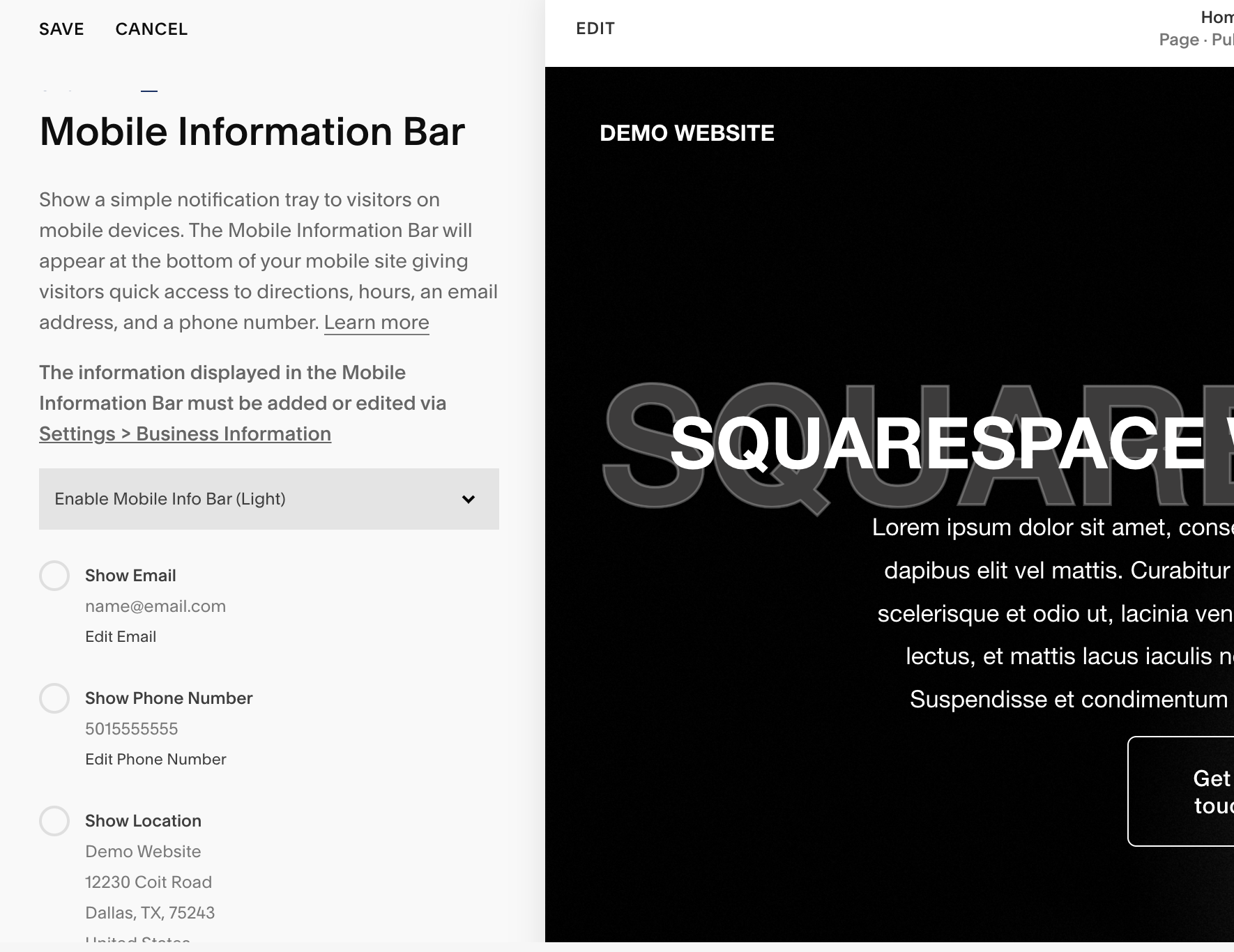
Step 1: Access the Mobile Information Bar Settings
Navigate to your Squarespace dashboard and select 'Pages'.
Scroll down to 'Website Tools' and find the 'Mobile Information Bar' option.

Step 2: Configure Business Information
Before you populate the mobile information bar, ensure your business information is correctly entered in the backend. Go to 'Settings', then 'Business Information' to add or edit your details.
Add your business email, phone number, and address. Make sure the address links correctly with Google Maps for accurate directions.

Step 3: Customize the Appearance
Squarespace allows you to choose between a light or dark theme for your mobile information bar to match your website’s design.
Decide which information to display. You might want to include all options or select specific ones, such as omitting the email if you prefer not to receive communications this way.
Step 4: Test and Adjust
After setting up the bar, save your changes and preview the mobile version of your site.
The mobile information bar should appear at the bottom of the screen and disappear as you scroll, reappearing when the user stops scrolling.

Best Practices for Using the Mobile Information Bar
Keep It Simple: Only include essential information to avoid clutter.
Test on Multiple Devices: Ensure the bar displays correctly across different mobile devices and screen sizes.
Update Regularly: Keep the information up to date, especially your operating hours and contact details.
Conclusion
The mobile information bar is a simple yet effective tool to improve the mobile user experience on your Squarespace website. By providing immediate access to key business information, you enhance user interaction and increase the likelihood of customer engagement and satisfaction.
📨 Join my mailing list to get Squarespace tips & tricks right in your inbox
Your designer
I'm Bryan, a Squarespace web designer and founder of Abound Web Design. I have worked with all types of businesses and organizations from preschools to publishing companies to chiropractic clinics and everything in between. If you want to discuss a potential project, you can email me at bryan@aboundwebdesign or get in touch with me here. Alternatively, you can book in a free 15-minute consultation call here.